Upper Crust Bakery
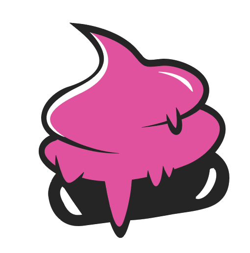
My project for Upper Crust Bakery strikes a balance between tradition and modernity, designed to resonate with both loyal, long-time customers and a new, younger audience. The updated logo combines a playful, hand-drawn style with a minimalist aesthetic, featuring a stylized, bold typeface and a vibrant pink accent that pops against the darker, neutral tones. The visual elements convey a sense of warmth and creativity, appealing to those who value both the craft of traditional baking and the freshness of contemporary design.
The packaging uses a clean, repeating pattern with the new logo to give a cohesive and polished feel while maintaining a sense of fun and approachability. The choice of a warm background color evokes a homely, comforting atmosphere, reminiscent of the bakery's heritage, while the clean lines and simplicity of the design hint at modern tastes. This blend of old-world charm with a fresh, updated look aims to retain the bakery's legacy while inviting a broader, more diverse customer base to enjoy its offerings. The rebranding effectively captures the heart of Upper Crust—quality baked goods with a flair that's both familiar and excitingly new.


